Research backed approaches to design user interfaces for the aging population
Modern web design moves fast, and as interfaces become more minimal, one group is often left out: older adults. Whether it’s tiny text, confusing navigation, or hard-to-spot buttons, modern design frequently prioritizes the needs and preferences of younger users while making the web more difficult for seniors to use.
Ageism in design isn’t usually deliberate, but it’s everywhere. It shows up in the small, subtle ways that websites, apps, and interfaces are built – ways that can make it tough for seniors to engage. Designers might not think twice about using trendy, low-contrast color schemes or building complex animations and hover effects that make a page feel dynamic. But for some users, these design choices can be barriers.
This isn’t just an oversight – it’s a form of ageism built into the design process. By favoring aesthetics and innovation over accessibility, we’re unintentionally excluding a large, growing demographic. This article will explore how web, UI, and visual design often leave older users behind. Drawing on a literature review of senior-focused UX research and real-world examples, we’ll examine why this happens, its impact, and how we can do better.
Ageism in design isn’t usually deliberate, but it’s everywhere.
What the research says
Cognitive changes
Studies identify cognitive changes as having a high impact on senior users’ ability to interact with web interfaces. These changes may impact memory recall, multitasking, and processing new information. A consistent recommendation in the literature is to simplify user interfaces to make them more intuitive and tailored to the needs of older adults.
Simplifying the interface doesn’t mean removing important information or features. It means reducing complexity by prioritizing clarity and usability. Ways to do this include
- prioritizing key information (information architecture)
- User testing
- Progressive disclosure
- Readability assessments
Improving interaction design through simplification can ease this frustration and create a more accessible experience. Research also emphasizes the importance of evaluating information architecture to reduce cognitive load for this demographic.
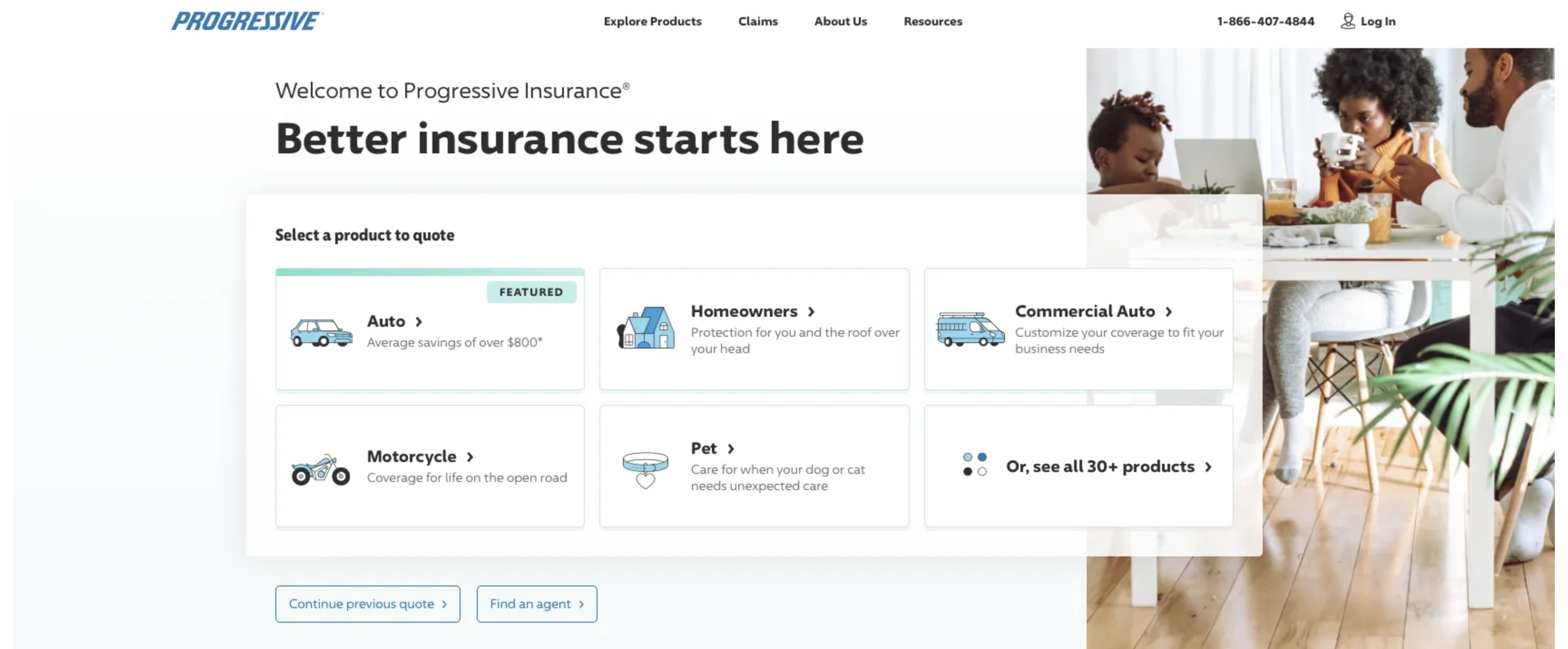
Progressive’s website has a simple, shallow menu structure and presents only relevant information on the screen. The information architecture enables a user to easily buy products, file a claim, or learn more.
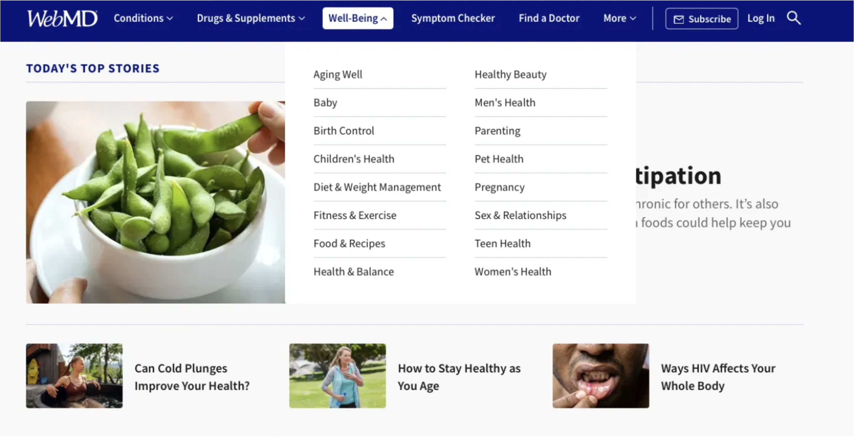
WebMD uses a clear navigation structure with consistent system behavior and simple language. These attributes are also crucial to reducing confusion and enhancing usability for older adults [8].
Consistency with web patterns is important. I learned this lesson the hard way. In a recent usability study I conducted, a participant attempted to use a “search” button on a form as a global search feature.
Vision, hearing, and precision in movement
Vision, hearing, and precision in movement can all make using the web more difficult for older adults. Studies confirm that these factors contribute to the challenges seniors face when using touchscreen devices. Small text sizes, low contrast, and small interface elements were frequently cited as barriers that make it hard for seniors to navigate websites and mobile applications. Touch and gesture-based interactions, which require fine motor skills, are another important consideration. One study sought to uncover the behaviors and preferences of older users when performing common touchscreen gestures like tapping, dragging, and pinching. Surprisingly, they found that seniors preferred dragging and pinching over tapping. These users experienced significant improvements in accuracy after a week of practice, suggesting that learnability can play a role in improving user experience. Gestures like drag-and-drop or tap-and-hold can still be challenging due to physical and cognitive changes, often resulting in low task completion rates [8].
Features like AssistiveTouch on iOS can help mitigate some of these challenges, but consider designing for these needs in mind directly in your site or application.

The Medicare.gov website features a simple design, clear large text, and big (65px+ height) buttons. Using larger touch targets, at least 30 pixels, and providing clear, immediate feedback can help improve touch interactions [4].
One key finding from the research is that seniors struggle with interfaces that require fast responses and assume familiarity with modern design patterns. Examples of this include:
- Auto-advance features (e.g., in video streaming)
- Sales or promotion countdowns
- Forms and surveys
- Security features, such as multi-factor authentication (MFA), captcha, and session timeouts
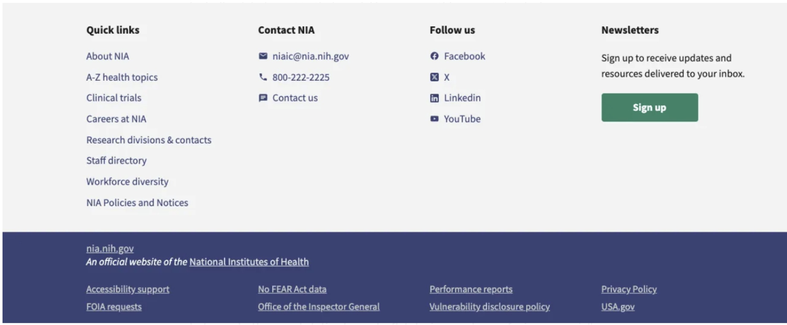
In the “Follow us” section, the National Institute on Aging does a great job of including labels next to their social icons, something most site designers seldom do. Designs that prioritize sleekness over clarity, like icons without labels or buttons without borders, can be particularly problematic. Seniors are more likely to second-guess what’s clickable and how to move forward within a flow. They tend to prefer interfaces with clear labels, obvious buttons, and simple, predictable layouts.
The problem with design trends
Some of the biggest offenders in excluding older users are design trends that prioritize form over function.
Flat design
While flat design looks clean and modern, it often strips away the affordances that help people navigate easily. With fewer visual cues and distinctions between buttons and static elements, flat design can be confusing, especially for seniors. A user might struggle to tell what is clickable and what isn’t. Consider how many interactive elements exist on the screen and whether it’s clear what each one does. For instance, buttons that lack borders, focus states, or hover states can frustrate users who are less familiar with such design conventions.
Minimalism
Minimalism is another trend that, when taken too far, removes important context from the interface. A common example is a form with only a few input fields visible at a time, which may look sleek, but for seniors, who often prefer to see the entire form before starting, this design can be disorienting. They may not know how much longer they’ll be expected to interact with the page. Additionally, motion-heavy interfaces can be distracting or overwhelming, especially for users who process information more slowly. Avoid overusing elements that slide, fade, or change unexpectedly (I’m looking at you, WebFlow template designer!).
<img src=“/dior.png” style=“max-width:100%;” alt=“alt=“Dior website” shows two large images and difficult to read text.”>
A good example of these challenges is the Dior website. The page is undeniably beautiful, but there is minimal information on display, and the text can be difficult to read over the large background images. A user unfamiliar with the site might struggle with navigation. Worse, someone with trouble reading the small, low-contrast text might give up before they can move beyond the landing page. Research shows that seniors are more likely to abandon tasks online due to frustration [10].
The challenge of evolving guidelines
As technology evolves and the elderly population grows, it can become increasingly difficult for designers to bridge the gap and create modern experiences that are usable for all. As guidelines become more inclusive, they also become more complex [7]. Designers now have to account for various modalities, such as touchscreen interactions, assistive devices, and device settings.
This complexity can be a double-edged sword. On the one hand, it pushes for better inclusivity; on the other, it introduces new challenges for older adults who may not be familiar with these modalities. For example, flexibility in input methods, such as allowing for both text input and voice recognition, can help reduce barriers.
Becoming a more inclusive designer
Value function over form
Yes, large buttons and big text may not look as modern, but designing for function benefits everyone. Design for people, not for dribbble!
Incorporate clear visual cues
When using flat or minimalist design, ensure buttons are easily identifiable, either through labels, borders, or hover effects. Always test these design choices with older users to ensure clarity.
Design for flexibility
Offer alternatives to gesture-based navigation, such as menu buttons or voice commands, and avoid complex motion-based interactions that can overwhelm seniors.
Ensure readability
Follow WCAG standards for text size and contrast, testing with older users to ensure readability across different screen types.
Design touch interfaces for dexterity
Implement larger touch targets and testing touch interaction on various devices. Also, advise reducing the reliance on precision-based gestures like drag-and-drop, which may frustrate users with limited dexterity.
Test for usability with haptic feedback
Conduct user testing to evaluate the effectiveness of haptic feedback for older users. Not all seniors may benefit from haptics, so providing alternative visual or auditory feedback is key.
Use checklists and usability testing
Usability tests and heuristic evaluations can predict many usability issues early on [8]. Incorporating design checklists and conducting usability tests should be standard in your design process to ensure accessibility from the start. The challenges that older adults face in using websites and apps highlight a broader issue: design should prioritize accessibility and usability just as much as aesthetics. Whether it’s rethinking flat design, simplifying complex interactions, or ensuring learnability, these changes don’t just benefit seniors - they improve the experience for all users.
It’s time we move beyond design trends and start focusing on creating interfaces that are intuitive and flexible, meeting users where they are, regardless of age. This way, we can ensure that the digital world remains open and accessible to everyone, not just the tech-savvy.
Additional Resources
- Flat-Design Best Practices – NNgroup
- Usability for Seniors: Challenges and Changes – NNgroup
- Accessibility Fundamentals – Web Accessibility Initiative
- Progressive Disclosure – Interaction Design Foundation
- Design Heuristics Checklist for Seniors – Silver Design Framework
Additional research & references
- Becker, S. A. (2004). E-Government Visual Accessibility for Older Adult Users. Social Science Computer Review, 22(1), 11–23. https://doi.org/10.1177/0894439303259876
- Carmien, S., & Manzanares, A. G. (2014). Elders Using Smartphones - A Set of Research Based Heuristic Guidelines for Designers. Lecture Notes in Computer Science, 26–37. https://doi.org/10.1007/978-3-319-07440-5_3
- Kane, L. (2019, September 8). Usability for seniors: Challenges and changes. Nielsen Norman Group. https://www.nngroup.com/articles/usability-for-senior-citizens/
- Kobayashi, M., Hiyama, A., Miura, T., Asakawa, C., Hirose, M., & Ifukube, T. (2011). Elderly User Evaluation of Mobile Touchscreen Interactions. Human-Computer Interaction - INTERACT 2011, 83–99. https://doi.org/10.1007/978-3-642-23774-4_9
- Lin, C. J., Hsieh, T.-L., & Shiang, W.-J. (2009). Exploring the Interface Design of Mobile Phone for the Elderly. Human Centered Design, 476–481. https://doi.org/10.1007/978-3-642-02806-9_55 6.National Library of Medicine, U. S. (2004, April 18). Making your web site senior friendly: A checklist. repository.arizona.edu. https://repository.arizona.edu/handle/10150/106378
- Petrovčič, A., Taipale, S., Rogelj, A., & Dolničar, V. (2017). Design of Mobile Phones for Older Adults: An Empirical Analysis of Design Guidelines and Checklists for Feature Phones and Smartphones. International Journal of Human-Computer Interaction, 34(3), 251-264. https://doi.org/10.1080/10447318.2017.1345142
- Salman, H. M., Wan Ahmad, W. F., & Sulaiman, S. (2018). Usability Evaluation of the Smartphone User Interface in Supporting Elderly Users From Experts’ Perspective. IEEE Access, 6, 22578–22591. https://doi.org/10.1109/access.2018.2827358
- Tobie van Dyk, Helene Gelderblom, Karen Renaud, Judy van Biljon (2013). Mobile Phones for the Elderly: a design framework. In Steyn, J., Van der Vyver, A.G. (eds.). Public and private access to ICTs in developing regions. Proceedings of the 7th International Development Informatics Conference (IDIA2013), 10. Bangkok, Thailand, 1–3 November. ISBN: 978–0–620–58040–3M Yang, M., & Huang, H. (2015). Research on Interaction Design of Intelligent Mobile Phone for the Elderly Based on the User Experience. Semantic Scholar. https://doi.org/10.1007/978-3-319-20892-3_51