Improving healthcare access for blind and low vision users
This study aimed to identify the obstacles bling and low vision (BLV) users encounter when navigating ZocDoc.com and provide actionable insights for improving the site’s accessibility, specifically focusing on enhancing usability through compliance with Web Content Accessibility Guidelines (WCAG).

Overview
This project evaluated the accessibility of ZocDoc.com, a healthcare information website, for users with blindness and low vision (BLV). This study was conducted as part of the Masters in Human-Computer Interaction program at DePaul. We chose ZocDoc because they welcome feedback related to accessibility enhancements.
Objectives
- Identify accessibility barriers for BLV users when using ZocDoc to search for providers and schedule appointments.
- Determine how the site aligns with Web Content Accessibility Guidelines (WCAG) and areas where it falls short. Provide actionable recommendations to enhance ZocDoc’s accessibility for BLV users.
Some information in this case study may be changed to protect confidential or private information. All information and views presented in this case study are my own and do not reflect the views of ZocDoc.
The Challenge
As the population of individuals with blindness or low vision is expected to double by 2050, the need for accessible digital healthcare services is critical. ZocDoc, a popular platform for finding healthcare providers and booking appointments, plays a significant role in providing healthcare access. However, many BLV users face barriers while navigating the site, which diminishes their confidence and ability to use the platform independently. Our goal was to evaluate the accessibility of ZocDoc.com for BLV individuals and uncover usability issues that hindered their experience.
How might we propose improvements to make Zocdoc more accessible for individuals who are blind or experience low vision?
Recommendations
This project was submitted as part of HCI masters coursework, you can read the Accessibility Study Research findings. Based on our findings, we proposed several improvements to ZocDoc.com that would greatly enhance its accessibility for BLV users:
Improved Navigation and Labeling
Ensure all interactive elements (e.g., buttons, form fields, modals) are properly labeled for screen readers. Add clear headings and appropriate landmarks to improve page navigation and clarity. Streamline navigation paths and improve the consistency of headings and tab orders, so that BLV users can more easily understand and traverse the site.
Streamline Provider Listings
Group sponsored providers in a separate, clearly labeled section to avoid repetition and confusion. This allows users to skip over these listings after viewing them once.
Enhance Interactive Elements
Adjust the behavior of combo boxes and form fields to ensure they work as expected with all screen readers. Ensure that forms follow a logical tab order and do not auto-navigate to tooltips. Redesign Appointment Scheduling: Simplify the calendar grid interface for easier screen reader navigation. Ensure modal dialogs are announced properly when opened, and provide clear instructions for selecting appointment times. Clarify and label filters to ensure they are accessible via screen readers and function as expected for all users.
Research Process
I facilitated 2 of 4 remote, moderated usability studies with blind participants, all of whom used screen readers to navigate the web. Participants were recruited using the university’s network. Our methodology consisted of:
- Task-Based Usability Testing. Participants were asked to complete three key tasks on ZocDoc: searching for a provider, selecting a provider, and scheduling an appointment.
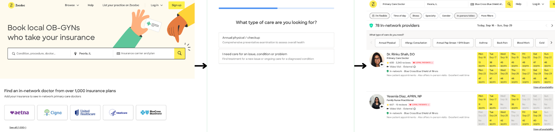
- Flow 1, shown below, requires the user to use the search page, select a service, and navigate the provider listing page
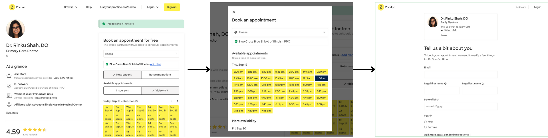
- Flow 2, also below, requires the user to select a provider, select a date and time for an appointment, and fill out the appointment form
-
Think-Aloud Protocol. Participants verbalized their thoughts during tasks, allowing us to capture insights into their cognitive processes and challenges.
-
Post-Task Questionnaires. Participants rated task difficulty, satisfaction, and confidence levels after each task to gauge their overall experience. Due to the low statistical significance of a small sample size, we focused on qualitative insights and patterns that objectively impacted the screen reader user experience.
Findings
Our study identified significant accessibility barriers across all tasks. While participants were able to complete some tasks, their experience was marred by inconsistent navigation, improperly labeled elements, and incompatibility with screen readers.
Task 1 - Search for a provider
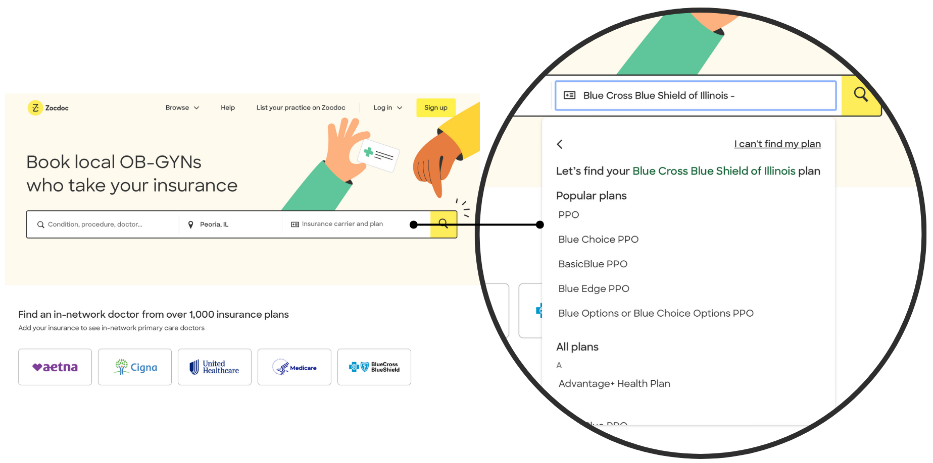
Although all participants completed the task, only half used the expected “happy path.” Issues included improperly functioning combo boxes and navigating headings on the home page, causing confusion for participants relying on specific screen reader commands. Satisfaction with this task was notably low, with an average score of 2.47 out of 4.
While easy to navigate using a mouse, the combo box was challenging for screen reader users and shortcuts did not work as study participants expected.
Task 2 - Select a provider
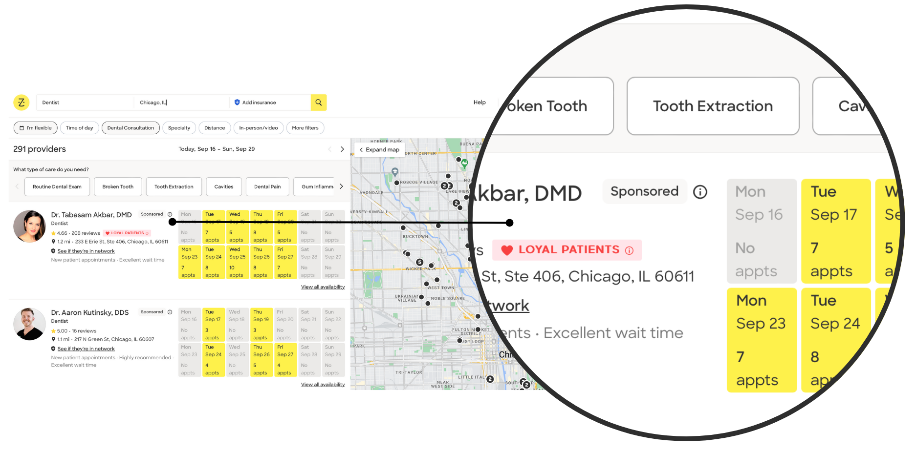
Participants struggled with navigating provider listings. The presence of sponsored listings confused some users, and two participants encountered issues using filters. One participant resorted to unconventional methods to navigate the site by navigating through each individual elements using a shortcut. The average satisfaction score for this task was 3.08 out of 4.
It was unclear that the first few listings were sponsored when navigating using a screen reader. The sponsored listings are at the top of each page in the search results, making it unclear to participants that they successfully navigated to a new search results page.
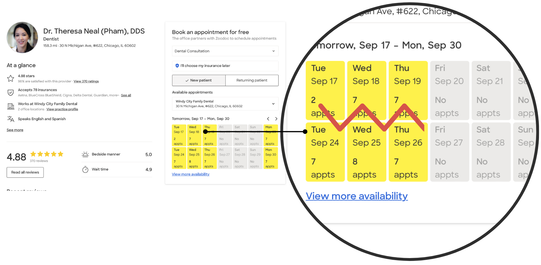
Task 3 - Schedule an appointment
This task proved most challenging, with only two participants completing it. The calendar interface was difficult to navigate via screen readers, and improperly labeled buttons caused confusion. Two participants were unable to complete the task successfully due to improper use of focus trapping, and the average satisfaction score for this task was 2.53 out of 4.
At the time of the study, the calendar used the css grid display property, causing keyboard navigation to follow an unexpected top-to-bottom pattern instead of the expected left-to-right. This has since been resolved!
Results and Impact
Our study not only identified critical usability issues but also provided actionable insights that can guide ZocDoc toward a more accessible experience for BLV users. By implementing the recommended changes, ZocDoc could:
- Enhance user satisfaction, especially for users relying on assistive technologies.
- Increase task completion rates for essential actions like scheduling appointments.
- Foster greater confidence and independence among BLV users, allowing them to navigate the platform with ease.
Although the participants could complete some tasks, the overall usability and satisfaction scores were low, revealing substantial room for improvement.
Future Work and Reflections
Future directions for this research include:
- Accessibility audit. ZocDoc.com should undergo a formal WCAG 2.2 audit to identify and correct the broader accessibility issues uncovered during this study.
- Cross-Site comparative study. A comparative analysis of other healthcare platforms could provide further insights into best practices for designing accessible healthcare websites for BLV users.
- Expansion of research scope. Future research should explore diverse BLV user groups, including individuals with varying degrees of vision loss and technology experience, to further refine accessibility solutions.
- Exploration of multimodal interactions. Investigate opportunities to implement multimodal feedback, such as auditory cues or haptic feedback, to aid BLV users in navigating the website with more precision and confidence.