Navigate the Tate
Navigate the Tate is a conceptual project for the Tate Modern gallery in London, England. This integrated experience enables gallery visitors to make the most of their visit by efficiently navigating the gallery and creating long-lasting memories.
Overview
This integrated experience enables gallery visitors to make the most of their visit by efficiently navigating the gallery and creating long-lasting memories. Visitors will feel satisfied knowing that they’ve seen all the art they want to see and connected with the exhibits they love through physical and digital keepsakes.
Note: Some information in this case study may be changed to protect confidential or private information. All information and views presented in this case study are my own and do not reflect the views of the Tate Modern.
The Challenge
Visitors to large art galleries like the Tate Modern often face challenges navigating exhibits, finding information, and enhancing their experience through digital tools. The Navigate the Tate app was designed to improve this experience by offering digital ticket access, gallery maps, and a feature to request printed postcards of artworks. However, the app’s usability had not been fully tested, and there was uncertainty about how intuitive and user-friendly it would be for a broad range of users, from tourists to art enthusiasts.
How might an integrated solution improve the Tate Modern gallery visit experience?
Solution
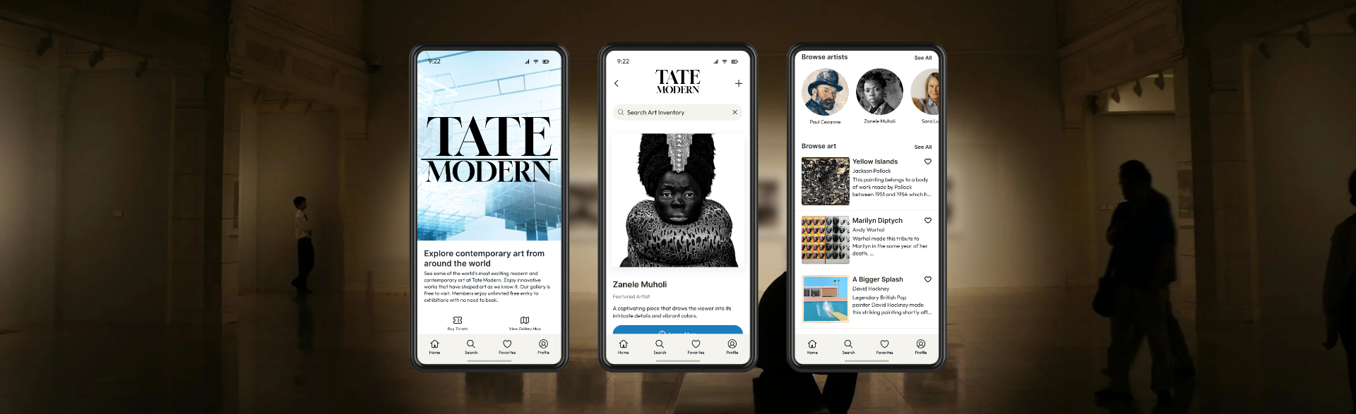
Our team created a Tate Modern app which enables visitors to easily find art and exhibits, navigate the museum and see exhibit wait times using an interactive map, and purchase souvenirs. I took primary responsibility for creating low and mid-fidelity wireframes for the full app usability testing, and created a high fidelity prototype to showcase one user flow.
Research Process
The team used a user-centered design approach to answer our research question. I conducted 3 of 8 user interviews and analyzed the results with my team to gather insights. Once clear opportunities for an integrated experience arose, we began the conceptual designs and prototyping. Lastly, we conducted usability evaluations to refine our approach.
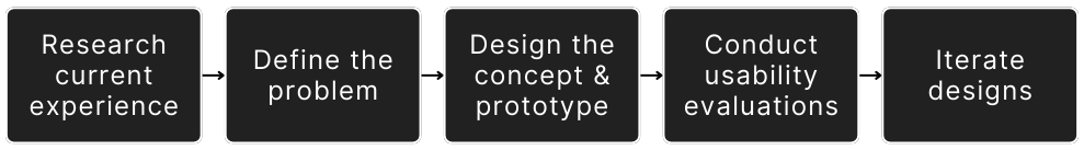
User Interviews
I led 3 of 8 user interviews, and 20-40 key data points were gathered per contextual inquiry. Each key data point was mapped to an affinity diagram to identify themes and insight clusters. Due to the large amounts of data collected and diagrammed, only a portion of the mapped data is shown below.
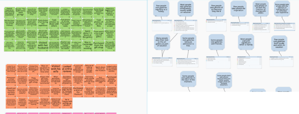
Personas and User Journeys
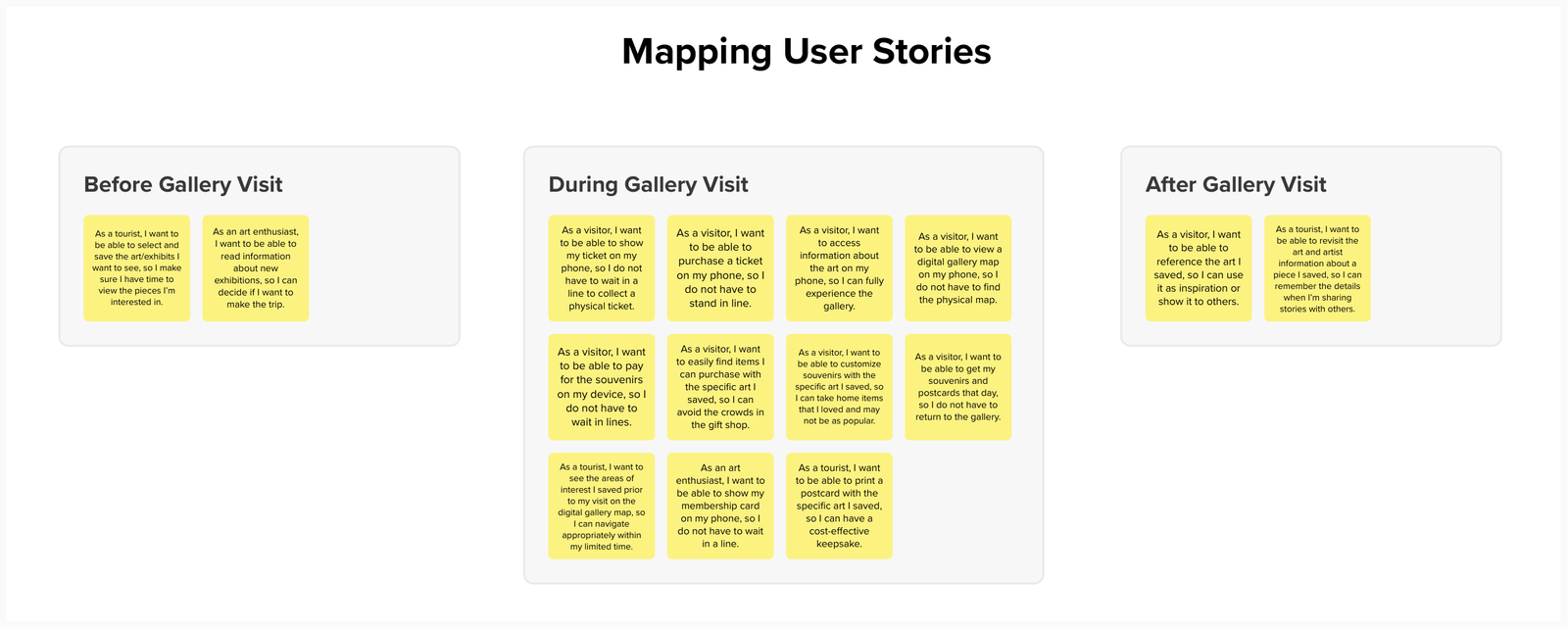
I took primary responsibility for mapping user attributes to a persona spectrum and drafted personas for gallery visitors. The team worked together to create a lightweight journey map. Through the interviews, we identified key scenarios which later informed our usability studies. This included finding an admissions barcode, purchasing an item from the gift shop, and finding specific art pieces. The study uncovered the goals and pain points of gallery visitors.
Insight Analysis
I collaborated with my team to reflect museum visitors’ problem statements into feature opportunities.
Motivations
An art gallery visit can be an easy unplanned activity for people. If a gallery is nearby, visiting it is an activity people can do with minimal planning.
Facilities
People's expectations of facilities and actual facilities do not align. Most visitors do not have enough time or energy to tour the full gallery due to it large size, lack of air conditioning, or limited available seating.
Art Viewing
People prefer self-guided tours over staff-led tours. They use maps, videos, and posted information available within the museum to learn about the art or exhibit.
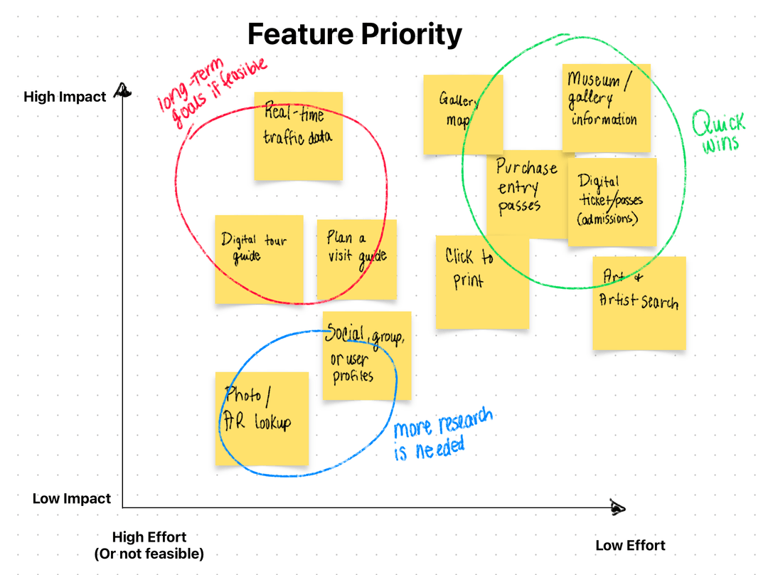
By diagramming these features on a feature-priority matrix, we were able to prioritize key features to include in our conceptual prototype and create user stories. A report-out of our insights can be found below to showcase research summary deliverables.
Concept Diagram
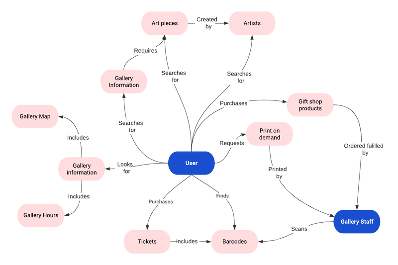
Once the features to be included in the prototype were identified, I created a concept map to visualize interactions and relationships between features, users, and gallery staff.
Research Outcomes
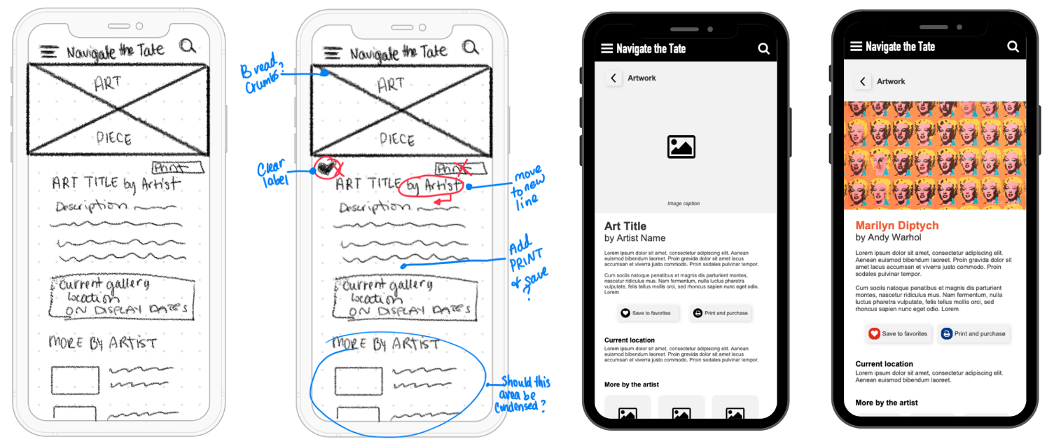
Once our team agreed on the direction of the solution and prioritized features, we started designing and evaluating those designs. I started by creating low-fidelity wireframes to iterate the design and get early feedback with low effort. I then created mid-fidelity wireframes and a working prototype in Axure for usability testing. The interactive prototype enabled users to click through to fully test the scenarios they were given, and Axure provided the most interactive features at the time.
We conducted tests of the interactive prototype to collect quantitative and qualitative data to assess the usability and user experience of the product. The evaluations were conducted online over Zoom and in person. The evaluation tasks focused on the user’s ability to navigate the gallery, find specific exhibitions, and request and purchase a postcard of a chosen art piece.
I used tables to record the number and type of errors committed, the number of times the user asked for instruction, and the success or failure of each task. Participants were asked to rate the difficulty of each task on a scale of 1-5 and provide reasons for their ratings.
After completing the tasks, a debriefing session was conducted to clarify any observed obstacles or confusing situations, gather more details about emotional reactions, and ask participants to rate their agreement with statements about their experience and willingness to use the product.
Key Learnings
- Data analysis showed that all users completed the Cezanne ticket selection task, but some users had errors or confusion regarding buying tickets or accessing tickets already purchased.
- Users generally responded positively and expressed satisfaction with the app, but some suggested design changes and clarifications for certain features, such as clickable images.
Improvement Opportunities
- One user had an issue sharing her screen, which impacted the evaluation.
- Some users were uncertain whether they were using the app as a user with an account or as a first-time user, leading to minor errors.
- Reviewing the protocol, which was created collaboratively, revealed attachments UX team members had to their ideas, resulting in leading questions.