Improving information architecture for the Peoria PlayHouse website
This project focused on redesigning the information architecture (IA) of the Peoria PlayHouse Children's Museum’s mobile site to improve the overall user navigation experience. The museum’s mission is to provide children with tools and inspiration to explore and create, but its outdated website made it difficult for users to find critical information such as event details, tickets, and membership options.

Overview
This project focused on redesigning the information architecture (IA) of the Peoria PlayHouse Children’s Museum’s mobile site to improve the overall user navigation experience. The museum’s mission is to provide children with tools and inspiration to explore and create, but its outdated website made it difficult for users to find critical information such as event details, tickets, and membership options. This study was conducted as part of the Masters in Human-Computer Interaction program at DePaul.
Objective The primary goal of this redesign was to create a more intuitive structure that would serve the museum’s diverse user base, including caregivers, community supporters, and family gifters.
Some information in this case study may be changed to protect confidential or private information. All information and views presented in this case study are my own and do not reflect the views of the Peoria PlayHouse Children’s Museum.
The Challenge
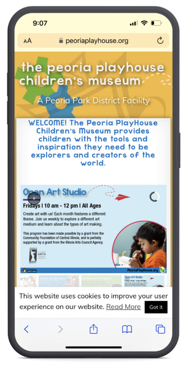
The Peoria PlayHouse website faced several challenges, including inconsistent labeling, ambiguous categories, and a cluttered layout. These issues made it difficult for users to quickly locate the information they needed, such as museum hours, event details, and donation forms. Furthermore, links to external sites for key actions like purchasing memberships created a disjointed user experience. Key issues identified were:
- Inconsistent navigation labels. Mixed task-based and topical categories confused users.
- Content clutter. Outdated blog posts and unclear categorization added unnecessary noise.
- Inconsistent purchasing experience.Some actions required navigating away from the internal site, creating a fragmented experience.
How might we make important information on site easier to find?
Recommendations
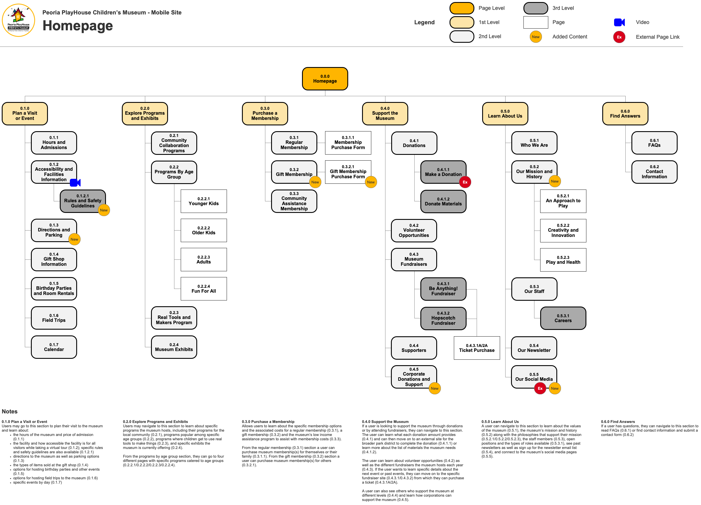
Task-Oriented Information Architecture
Navigation was redesigned around user tasks, leading to categories like “Plan a Visit” and “Support Us.” This structure was informed by the results of the card sort and tree jack tests, aligning with user mental models. Note: The final site map shown was created by my project team mate. I provided feedback and contributed to the research and content.
Improved Labeling & Consistency
Navigation labels were clarified and standardized to improve usability. Task labels, such as “Plan a Visit” and “Explore Programs and Exhibits,” were prioritized over topical labels that caused confusion in earlier versions.
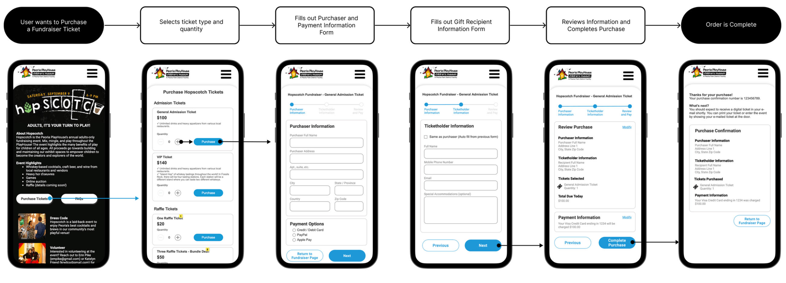
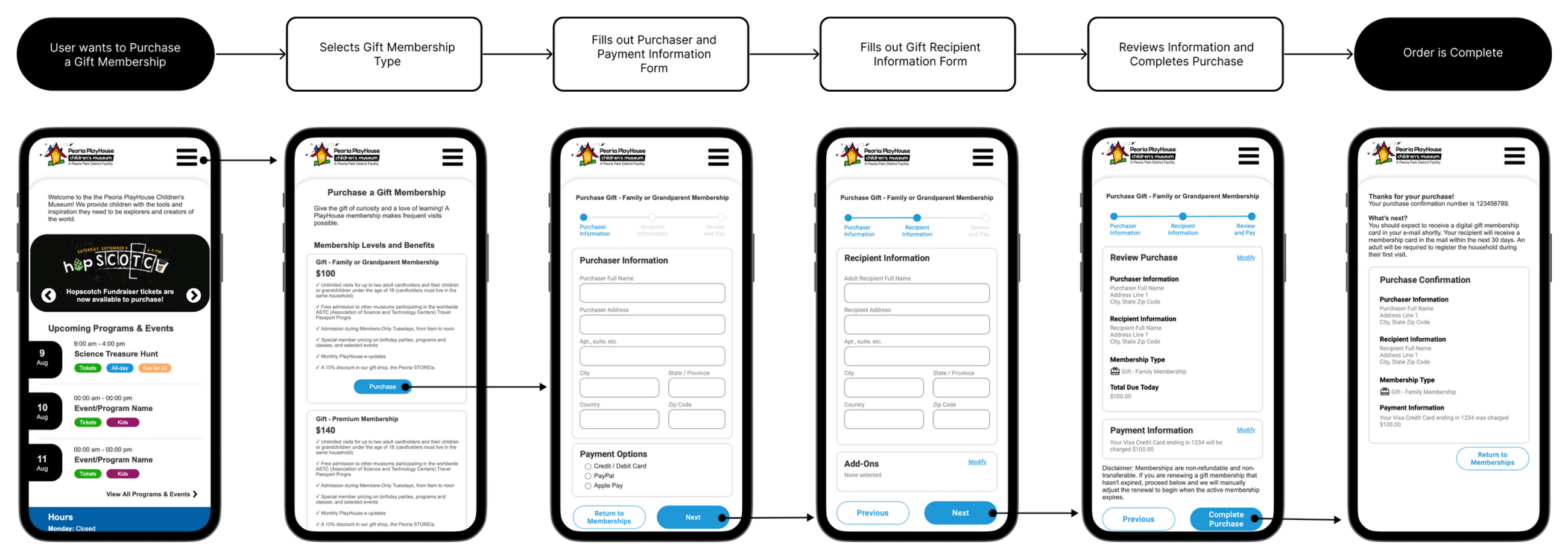 Streamlined Purchase Experience: The purchase flows for tickets, memberships, and donations were streamlined to avoid external site redirects. Wireframes introduced multi-step forms, simplifying long forms with clear instructions and progress.
Research Process

Content Inventory
I completed a content inventory for half of the site (split with team member) by determining the scope of content being revised, documenting categorized navigation levels and pages, gathering and documenting URLS and page content, and identifying missing, inaccurate, or redundant content. The content inventory uncovered opportunities to remove outdated blogs and articles, lack of consistency in categorization themes in the navigation, ambiguous page labels, and links to external sites with inconsistent experiences.
User Personas & Task Analysis
As a team, we interviewed 15 community members three key personas: Caregivers, Community Supporters, and Family Gifters, each representing a typical user of the museum’s website. Task flows were created for each persona, focusing on core actions like purchasing tickets, finding events, and making donations.
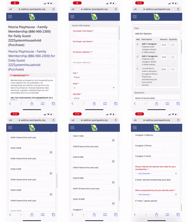
- Two key tasks were selected as part of the redesign because the purchasing experience across the site was inconsistent. Issues identified with the purchasing process include:
- Interface design that did not match the other purchase experiences and the site’s design
- Long forms with a possible 30+ fields per screen, increasing the likelihood of abandoned purchase attempts
- Required form fields for optional data with instructions to the user to enter “n/a”
- The site’s content did not show clear visual hierarchy
Opportunities
- Update the purchasing experience for both tasks to have a consistent look and feel with each other and the rest of the website.
- Group long-form fields and create a multi-page form that gives the user a clear understanding of where they are in the process and the ability to go back to make changes quickly.
- Make non-required form fields optional.
Research limitation: We do not have enough information about customers’ purchasing habits.
This meant we had to make assumptions about the likelihood they would be a returning customer, how often they make purchases on the site, and whether a customer would buy multiple memberships and fundraiser tickets on the same day. We opted not to include account creation or purchasing cart due to long order forms. Additional interviews and data analysis can be used to improve this experience further.
Card Sorting
Four rounds of card sorting, including open and hybrid methods, were conducted to reorganize the site’s structure. The goal of our first open card sort among our two group members was to determine common groupings of 2nd level categories (25 cards) so we could propose new 1st level categories and determine an organizational scheme for the mobile site.
The goal of the remaining three hybrid card sorts was to test the newly updated 1st level categories by having users group 2nd level content cards under them. The end goal was a refined recommendation for both levels that matched users’ mental models.
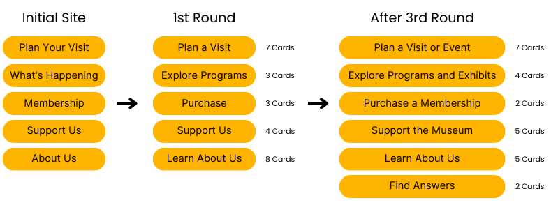
These exercises helped clarify user expectations for navigation labels and revealed a preference for task-oriented categories like “Plan a Visit” and “Support the Museum.”
Tree Jack Testing
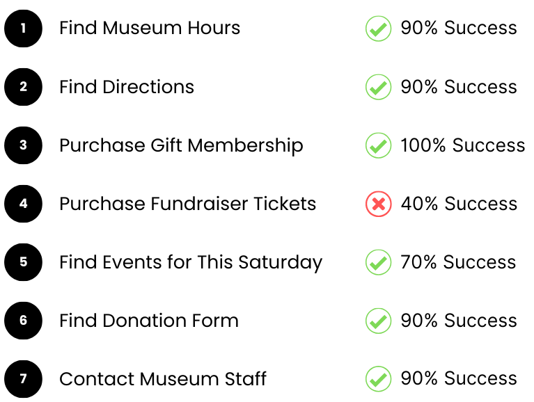
The newly proposed IA was tested through tree jack testing to determine whether users could successfully complete key tasks, such as finding museum hours or purchasing a gift membership. These tests were performed in three rounds with a broad user base to evaluate success rates and fine-tune the final navigation structure.
Wireframes & First-Click Testing
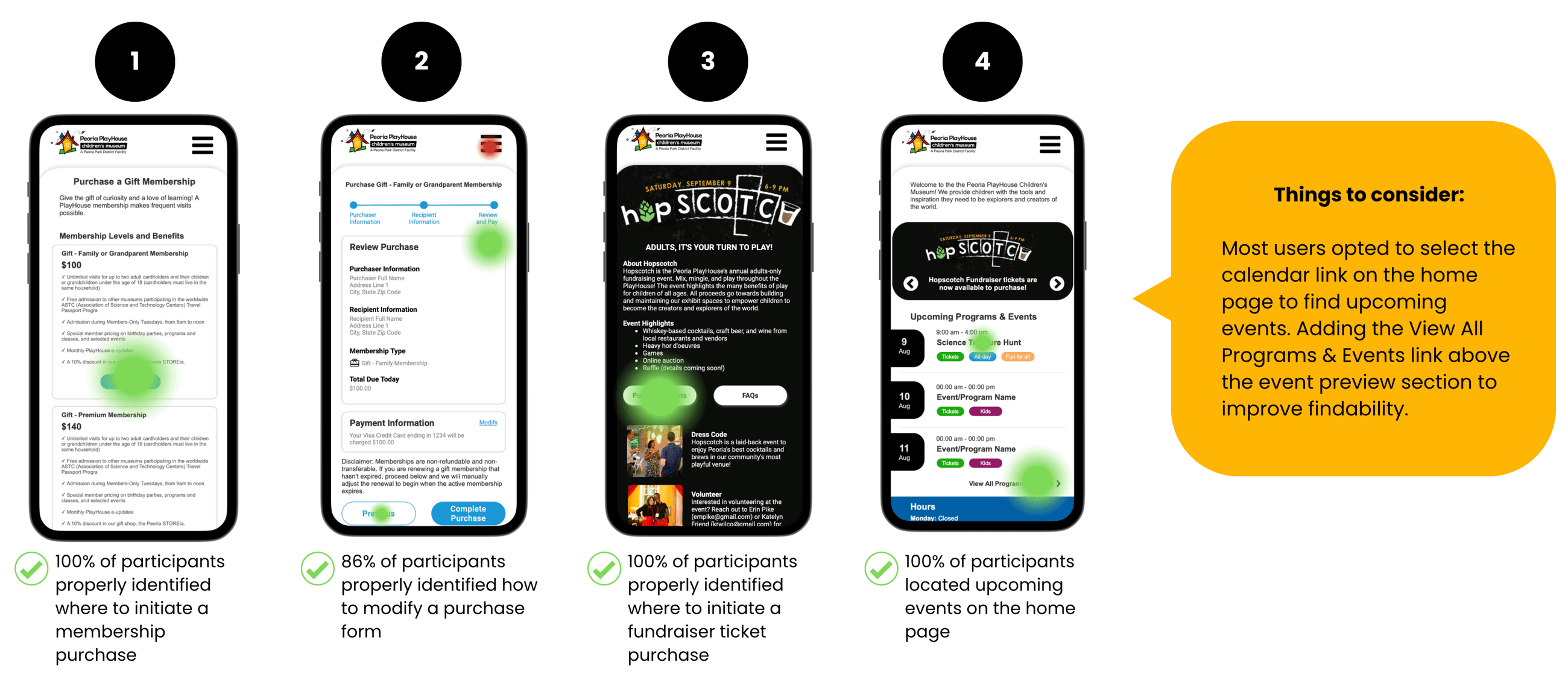
I created wireframes for the new flows and conducted a round of first-click testing with 7 randomly selected participants. The goal was to learn about the effectiveness of some of the important screens in the key tasks and whether we could make events easier to find since we received inconsistent results in previous tests with the placement of the Events Calendar in the primary navigation menu.
Analysis of the test data helped us learn…
Can participants initiate a membership purchase?
Can participants modify an error in their membership purchase?
Can participants initiate a fundraiser admission ticket purchase?
Can participants find upcoming events?
Findings
The research revealed several critical insights:
Clearer Labels Were Essential
Inconsistent and unclear labels in the original navigation caused confusion for users, particularly when trying to find tickets or donations. Task-based labels significantly improved navigation.
Task-Based Grouping Was Preferred
Users consistently grouped categories based on key actions. Categories like “Plan a Visit” and “Support Us” resonated with users as they focused on their immediate needs and goals.
Improved Success in Testing
Across the three rounds of tree jack testing, overall success rates for key tasks improved to 89% in the first round and stayed consistent at 81% in the final round. Directness, or the ability to find information without unnecessary detours, also improved significantly between rounds.
First-Click Success Rates
First-click testing showed high success rates, with 100% of participants correctly identifying where to initiate key actions like purchasing a membership or a fundraiser ticket.
Results and Impact
While this project was for academic purposes and the redesign has not been implemented on the live site, testing results indicate a significant improvement in user navigation:
- 89% success rate in task completion for key actions, such as finding museum hours or purchasing memberships, with high confidence in the navigation structure.
- 100% success in first-click tests for initiating key tasks, demonstrating the intuitive nature of the redesign.
- The redesigned site structure significantly reduced the confusion around task completion, particularly for complex flows like purchasing fundraiser tickets or finding upcoming events.
Future Work and Reflections
- Expand testing to a broader audience, including real-world users of the Peoria PlayHouse site, to gather feedback post-launch.
- Incorporate a customer account system to further streamline the purchasing process for frequent visitors.
- Monitor usage analytics to track how the new navigation impacts user engagement and task success rates over time.